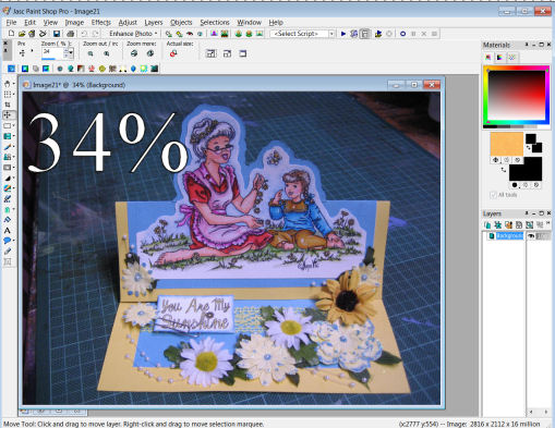
Well this is a nice little bonus for everyone. I emailed JenLee asking for her permission to use her Christmas Mouse Sleeping card as an example in my last little Step by Step creating a digital. This was her reply so I'm very happy to pass it onto everyone. I adore JenLee's method of colouring and I hope that others will be able to benifit from her expertise. All the photos on this page are done using this method by JenLee and you can see many more of her amazing creations on her website ABC-Art, Bellydancing & Crafting
Prepare:
1. Chose digi-image, cut and paste to a MS Word document
2. Click on digi and resize to usually no larger than 10cm (4 inches) either in wide or breadth
3. Print on inkjet printer -settings "fast normal"," black ink only" onto 160 gsm cardstock, - I am not sure if this is an international weight, but it's a about the weight of scrapbooking cardstock. I always use the cheapest I can find because it doesn't affect the final outcome of the coloured digi at all
4. Heat set print to prevent smudging and bleeding
5. Trim the digi to a little larger than the finished size you require. (I always leave a little larger piece on the right hand size to "test" colours next to each other
6. Here's the tutorial for the colouring technique I devised
JENLEE'S GUIDE TO COLOURING A DIGISTAMP – with coloured pencils
You will need :

Printed digistamp preferably laser printed but you can print on a inkjet printer, on the “fast normal” setting, and if you can, use black ink setting only and then it must be heat set using a heat gun or over the toaster – DON’T SCORCH IT!
Coloured pencils They don’t need to be watercolour pencils – I use a set of 24 Staedtler Noris Club pencils (R50 at Supermarket)
Artist’s white spirits aka Odorless Turpentine / odorless mineral spirits
No 0 (and no 00 optional) paintbrush and/or cotton buds (Q-tips) I have both but seem to use the no 0 brush mostly
Tiny container for turps Like a milk bottle cap or anything that size
Absorbant paper A tissue or a kitchen roller towel sheet to dry your brush after rinsing in the turps between painting different colours
Now this is the EASY way to do it, without flops…
1. It’s best to work on a sheet of white paper or card.
2. Using your paintbrush or a cotton bud, paint a layer of turps over a small area that you want to colour. I usually start with the skin. You will see that the turps soaks into the paper and makes it a grey colour, and goes beyond the borders of the image. This is fine because it evaporates and disappears completely once dry. (I usually use a half-capful and pour it over the image, and wipe off the excesss with a tissue.
 3. Now while the turps is still damp (it will stay damp enough to work on for at least 30 mins), use your flesh coloured pencil and colour in the arms, legs, face, etc. You will feel that the pencil glides on VERY smoothly. Try and colour evenly, and leave no white spaces, although these can be rectified very easily later. For darker colours you will need a “light” hand.
4. Once you have coloured all the skin, again using the or a cotton bud brush and turps, paint over the area that you have just coloured with the pencil. You will find that the colour seems to liquify and “smoothes” out. It will remove a lot of the colour and a paler, chalky look will remain.
5. Then go onto the next area you want to colour, and repeat the process, until your whole digi is coloured.
6. At this stage you will be able to see any white, uncoloured areas show up clearly. To fix those, colour with the pencil and paint with the turps.
Now your digi is coloured and if you are satisfied with the result, leave it somewhere to dry.
*Your digi is dry when the damp patch all around the coloured image has disappeared. When it is dry you will see that you have a beautifully coloured image and there would be nothing wrong in leaving it that way.
*If you would prefer it to have some shading, you can go over the already coloured areas with the same colour pencil to do your shading – you need a little heavier “hand” here and must press a little harder.
*However, if you are fortunate enough to have two or three shades of the same colour in your set of pencils, you could experiment with using orange to shade yellow areas, dark green to shade lime green, and a pale brown to shade the skin areas, etc
*Once you have done the shading, use the paint brush and turps again over the whole coloured area to smooth it and merge the newly coloured areas with the previously coloured areas.
TIPS :
Some colours are “stronger’ than others and you will need to have a very “light” hand for these if you want a pastel look.
The more even your first colour goes on, the more even your final result, although the turps is a miracle worker.
Use small circular movements when painting over the coloured area with the turps, it seems to blend more easily.
The bigger the contrast between your light and dark shading, the more dramatic your effect and will give your finished product the WOW factor. This technique is not always suitable for some digital designs, it just doesn’t seem to work on an image for a baby card for me.
 There you have it – it’s flop proof and really inexpensive cos you can use both watercolour pencils and regular coloured pencils for this technique. I suggest that you buy a couple of sets from different manufacturers because the shades differ from pack to pack and this will help you in your shading., eg, the little eiderdown was coloured using four different shades of regular colour pencils, the last being bright orange which has created the puffiness to pop out off the plane.
.

For those of you who are a little more confident … attempt to use two or three colours on the first layer you put down : here, look at the bedside mat – the areas closest to you colour in lime green - press fairly hard – and then less pressure where you like the blending of lime green and grass green to be, then take your grass green pencil, lightly go over the lime green to blend the two and then increase the pressure with the grass green Then less pressure with the grass green for the blending with the dark green, take a dark green to colour lightly over the grass green and then increase to full pressure dark green on the furtherest edge of the mat. Use your cotton bud to blend all the colours into each other seamlessly
Once the coloured image is dry, I trim it down to my required size and start putting the card together. I love using my rounded corner punch - it gives the layers a finished look. I try to pick out a dominant colour and layer the coloured image into that, and as for embellishments I use just about anything!
Thank you JenLee.